

Responsive design for mobile app
-
wrote on 27 Apr 2017, 09:40 last edited by
Hello I would like to know how to set up a responsive layout on mobile devices (Android, Ios).
I'm implementing a login page, so with a box that needs to be centered and with two input texts and one key, I can not figure out the size of the phone (portrait, landscape).
Does anyone have an example, or can they indicate a technique?Thank you
-
Hello I would like to know how to set up a responsive layout on mobile devices (Android, Ios).
I'm implementing a login page, so with a box that needs to be centered and with two input texts and one key, I can not figure out the size of the phone (portrait, landscape).
Does anyone have an example, or can they indicate a technique?Thank you
Hi
Try
QRect rect = qApp->primaryScreen()->geometry();and see what it reports ? ( to find size)
-
@Clody21
Im not sure i understand.
Inside your mainwindow widget or any other place that gets run." imported QtWidget"
is this QML ?
-
wrote on 27 Apr 2017, 13:26 last edited by GTDev
Hi,
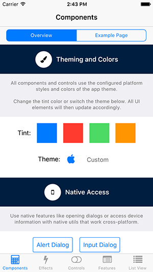
You might want to take a look at V-Play Engine for QML-based mobile apps and games. V-Play offers many components for creating cross-platform apps that automatically adapt their layout and UI to match the native iOS and Android user experience.V-Play comes with many open-source examples and project templates you can use as reference (there's also a template for a simple login-page). For an overview of the most important features, you can have a look at the Component Showcase demo:
To quickly learn the basic concepts you can have a look at some tutorials, for example Supporting Multiple Screens Sizes and Densities with V-Play Apps.
Hope this helps!
Best,
Günther
4/5