
QIcon not actually generating variations for QToolButton?
-
all my "icons" start life as QImage (possibly programmatically drawn), converted to QPixMap, then to QIcon.
so i get my QIcon, and set it into my QToolButton with
toolButtonP->setIcon(pix);says in the doc:
The simplest use of QIcon is to create one from a QPixmap file or resource, and then use it, allowing Qt to work out all the required icon styles
so i thought the "pushed down" state (drawn slightly darker) (as in when the user clicks on the button) would be generated on the fly for me.
if that's not the case, i can easily generate a darker image, but then how do i programmatically add it into QIcon as the "down state" so it's used by QToolButton?
-
please vote for it / watch it, if you care. thanks.
-
Hi
You can add via
https://doc.qt.io/qt-5/qicon.html#addPixmap
for the various states.
And yes normally it does generate for the other states when assigned in
Designer so try add same pixmap to that role and see if it does darken it. -
i've tried this:
QIcon			qIcon;

qIcon.addPixmap(pix, QIcon::Normal);

pix.Lighten(-0.2f);	//	negative is "darken"
// qIcon.addPixmap(pix, QIcon::Active);
qIcon.addPixmap(pix, QIcon::Selected);

toolButtonP->setIcon(qIcon);
but the QToolButton still doesn't show the darkened version when the user clicks on the button. tried both Active and Selected.
-
Hi,
Are you sure these methods do in place modifications ? Aren't they returning a modified copy of the pixmap ?
-
i have ensured it's doing a deep copy, here is updated code:
QIcon qIcon; qIcon.addPixmap(pix, QIcon::Normal); CPixels darkPix(pix); // deep copy, trust me darkPix.Lighten(-0.2f); // negative is "darken" qIcon.addPixmap(darkPix, QIcon::Active); //qIcon.addPixmap(darkPix, QIcon::Selected); toolButtonP->setIcon(qIcon); -
I'm not sure I am following you on that one. How did you ensure of the deep copy ?
But you also didn't answer my question: do these two methods do in place modification ? -
I'm not sure I am following you on that one. How did you ensure of the deep copy ?
But you also didn't answer my question: do these two methods do in place modification ?@sgaist cuz that's what my constructor does. it does this:
CPixels::CPixels(const CPixels& other)
{
	*this = other;

	#if _QT_
	{
		QImage&		self(*this);

		self = other.copy();
	}
	#endif
}
if you're asking if "Lighten()" does in-place mod, then yes. what other method are you referring to?
-
Hi
You can add via
https://doc.qt.io/qt-5/qicon.html#addPixmap
for the various states.
And yes normally it does generate for the other states when assigned in
Designer so try add same pixmap to that role and see if it does darken it.@mrjj it's not assigned in Designer, it's assigned in code
-
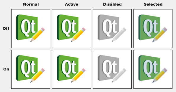
note that "state" doesn't seem to be different between "off" and "on", so what is its purpose?
-
Hi
on/off is used for Checkable buttons.
pr default its shown via the frame when checked but could
also have another icon. like big fat checkmark :)Adding
icon.addFile(QStringLiteral(":/test.svg"), QSize(), QIcon::Normal, QIcon::Off);
also generates the other icons as i can later paint with them.
(in paintevent)
icon().paint(&p,rect(),Qt::AlignCenter, QIcon::Mode::Disabled, QIcon::State::Off); -
i'm using QToolButton, and QImages which have already been created. I'm not loading QIcons directly from files. How do i create a QIcon that i can then load into QToolButton, such that when the user clicks it, it shows a "darkened" or "pressed" image?
-
does nobody else create QIcons programmatically, to be used in QToolButton?
-
does nobody else create QIcons programmatically, to be used in QToolButton?
QImage img(":/Icon.png"); auto toolButton = new QToolButton(toolBar); toolButton->setToolButtonStyle(Qt::ToolButtonTextBesideIcon); auto act = new QAction(); act->setIcon(QPixmap::fromImage(img)); act->setText("text"); toolButton->setDefaultAction(act); -
that code snip only adds in a single state (the up state). i have separate pngs for the down and disabled state that never get used. how do i cause my tool button to use those states?
-
that code snip only adds in a single state (the up state). i have separate pngs for the down and disabled state that never get used. how do i cause my tool button to use those states?
-
@kshegunov that's literally the code i'm already using but it's not working. see the code snips at the start of this thread, am I doing it wrong?
-
@kshegunov that's literally the code i'm already using but it's not working. see the code snips at the start of this thread, am I doing it wrong?
Yeah, sorry. I think it worked for a push button. could you try that? I don't recall currently if it's supposed to work with the toolbar button, I remember recently doing something akin but it was a table delegate so I was drawing it manually.
EDIT:
I think my brain had gone on a vacation ...
What style are you using? Is it possible the style doesn't support that? I usually use Fusion (i.e. Qt drawing). -
not sure what you mean by "style", i'm just using Qt out of the box, i haven't specifically selected a "style".
unfortunately the "QPushButton" does not draw the icon as "pressed" either, it just darkens the background which is not what i want:

-
not sure what you mean by "style", i'm just using Qt out of the box, i haven't specifically selected a "style".
unfortunately the "QPushButton" does not draw the icon as "pressed" either, it just darkens the background which is not what i want:
not sure what you mean by "style", i'm just using Qt out of the box, i haven't specifically selected a "style".
Judging by your screenshot you're using the native osx style.
From what I can see here: https://code.woboq.org/qt5/qtbase/src/widgets/styles/qcommonstyle.cpp.html#1700
The tool button only takes 3 icon states - active, disabled and normal. Selected isn't one of them. But that's for Fusion, I have no clue what goes in the native osx style. So first advice - switch to fusion and use Normal/Active to alternate between unpressed/pressed. If that's what you're expecting go back to the native style and see if the problem is there. If so I'd say it's either a bug or limitation of the native style's implementation. -
Fusionis un-mac-like, so i would not want to use it. strangely, "active" seems to mean "focused". when i click in the button it does turn color as expected but if i track the mouse (keep holding) while dragging OFF the button, it should re-draw in it's UP state, but it doesn't. when i let go it should do the same, but it STAYS looking pressed. if i then click the volume slider, the button THEN draws in the UP state. am i just not getting how this is designed to work?