
Font rendering issue (kerning)
-
Hi all,
I noticed the words of Text components in my QML app look pretty weird. Here are two examples:
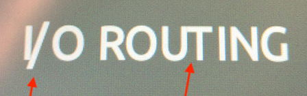
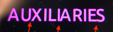
Why are the letters so unevenly distributed? It looks like some have a negative distance to the previous letter and a too large distance to the following. Where can I look to find the reason for that weird looking rendering?
Thanks,
Stephan -
Have you tried a different font? I believe the font has some information about kerning embedded. If the font is wrong QML can't do anything about that. Just making sure you are looking in the right place.
-
Have you tried a different font? I believe the font has some information about kerning embedded. If the font is wrong QML can't do anything about that. Just making sure you are looking in the right place.
@SimonSchroeder Thanks for your response. I didn't know the font itself contains information for the kerning. Since we use our own font, I went back to an older version and now the rendering looks fine again. I need to investigate what broke the font.