
Hiding a rectangle with a transparent rectangle
-
Hi,
I know the question sounds strange so let me explain.
I have this :import QtQuick 2.12 import QtQuick.Controls 2.12 //import QtQuick.Controls.Material.impl 2.12 import QtGraphicalEffects 1.12 Item { id: groupBoxItem property int labelLeftMargin: 16 property int borderWidth: 2 property string borderColor: "red" property int labelHorizontalPadding: 12 property int labelVerticalPadding: 6 property alias title: labelText.text property alias label: labelText Rectangle { id: labelRect x: groupBoxItem.labelLeftMargin y: 0 z: 20 height: labelText.implicitHeight + groupBoxItem.labelVerticalPadding*2 width: labelText.implicitWidth + groupBoxItem.labelHorizontalPadding*2 color: "transparent" border.color: groupBoxItem.borderColor border.width: groupBoxItem.borderWidth Text { id: labelText anchors.centerIn: parent color: "#AAAADD" font.family: "Exo" font.styleName: "Regular" font.pixelSize: 20 //font.weight: Font.Black text: groupBoxItem.title } } Rectangle { anchors.bottom: groupBoxItem.bottom anchors.left: groupBoxItem.left anchors.right: groupBoxItem.right id: contentRect z: 10 height: groupBoxItem.height - labelRect.height/2 color: "transparent" border.color: groupBoxItem.borderColor border.width: groupBoxItem.borderWidth } }The result is this when this component (which I named MyGroupBox.qml) :
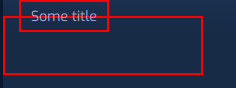
I want to be able to "hide" the border of "contentRect" for the part it overlaps with "labelRect". In a sense, I would like labelRect's background to point to groupBoxItem's parent.
Obviously, if I set the color of "labelRect" it would solve my problem, but I want the component to be entirely transparent.
The result I see (if not obvious enough):
I'm not totally sure if OpacityMask would work here? I have tried using it for that purpose, but without success.
Thanks!!
-
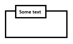
As this is quite a simple shape, I would do something like this (might require some tweaking for your use-case):
// main.qml
Window {
    visible: true
    width: 640
    height: 480

    RectangleWithLabel {
        anchors.centerIn: parent

        width: 260
        height: 120
        borderColor: "blue"

        label.padding: 10
        label.font.pointSize: 16
        label.color: "teal"
        label.text: "My Label"

        // indent label box with x value
        label.x: 20
    }
}
// RectangleWithLabel.qml import QtQuick 2.12 import QtQuick.Shapes 1.15 Shape { id: shape property alias borderWidth: shapePath.strokeWidth property alias borderColor: shapePath.strokeColor property alias label: label property int radius: 0 Component.onCompleted: { // prevent radius oversizing radius = Math.min(radius, label.height / 2) // prevent box beeing too narrow for label width = Math.max(width, label.width + label.x) // prevent box beeing too small for label height = Math.max(height, label.height) } ShapePath { id: shapePath strokeColor: "black" strokeWidth: 2 fillColor: "transparent" joinStyle: ShapePath.MiterJoin capStyle: ShapePath.RoundCap // begin on the 3 line intersection left to the label startX: label.x startY: label.height / 2 // line upwards to the top left corner of the label box PathLine { x: label.x y: 0 + shape.radius } // top left corner of label box PathArc { y: 0 relativeX: shape.radius radiusX: shape.radius radiusY: shape.radius } // upper horizontal line of the label box PathLine { x: label.width + label.x - shape.radius y: 0 } // top right corner of label box PathArc { y: shape.radius relativeX: shape.radius radiusX: shape.radius radiusY: shape.radius } // vertical right line of the label box PathLine { x: label.width + label.x y: label.height - shape.radius } // bottom right corner of label box PathArc { y: label.height relativeX: -shape.radius radiusX: shape.radius radiusY: shape.radius } // horizontal bottom line of label box PathLine { x: label.x + shape.radius y: label.height } // bottom left corner of label box PathArc { y: label.height - shape.radius relativeX: -shape.radius radiusX: shape.radius radiusY: shape.radius } // back to the starting point PathLine { x: label.x y: label.height / 2 } // go left for the upper horizontal line next to the label box PathLine { x: shape.radius y: label.height / 2 } // top left corner of main rectangle PathArc { direction: PathArc.Counterclockwise y: label.height / 2 + shape.radius relativeX: -shape.radius radiusX: shape.radius radiusY: shape.radius } // left outer vertical line of main rectangle PathLine { x: 0 y: shape.height - shape.radius } // bottom left corner of main rectangle PathArc { direction: PathArc.Counterclockwise y: shape.height relativeX: shape.radius radiusX: shape.radius radiusY: shape.radius } // bottom line of the main rectangle PathLine { x: shape.width - shape.radius y: shape.height } // bottom right corner of main rectangle PathArc { direction: PathArc.Counterclockwise y: shape.height - shape.radius relativeX: shape.radius radiusX: shape.radius radiusY: shape.radius } // right vertical line of main rectangle PathLine { x: shape.width y: label.height / 2 + shape.radius } // top right corner of main rectangle PathArc { direction: PathArc.Counterclockwise y: label.height / 2 relativeX: -shape.radius radiusX: shape.radius radiusY: shape.radius } // upper horizontal line, right to the label box PathLine { x: label.width + label.x y: label.height / 2 } } // the label text Text { id: label padding: 5 text: "" } }