
animation (time) isn't working
-
@fcarney interesting. I suppose I could try using a drawer instead of my collapsing rectangle. I'll do some experimenting and report back. Thanks.
@mzimmers there is a calculated rectangle as the children move around. I used clipping (not sure what this does to performance) to hide things inside the rect if the items exceed the height of the default content:
Rectangle { id: bar height: childrenRect.height width: 300 clip: true default property alias contents: contentItem.children property bool collapsed: true color: "lightblue" Rectangle { anchors.fill: contentItem color: "salmon" } Column { id: contentItem clip: true y: bar.collapsed ? -(contentItem.height - areaLayout.height) : areaLayout.height Behavior on y { NumberAnimation { duration: 500 } } // simulate content used in "contents" Text { text: "some text" } } Rectangle { anchors.fill: areaLayout color: "pink" } MouseArea { anchors.fill: areaLayout onClicked: { bar.collapsed = !bar.collapsed } } // columns expand contract based upon content Column { id: areaLayout width: bar.width Text { text: "normal bar content" } } } -
@fcarney interesting. I suppose I could try using a drawer instead of my collapsing rectangle. I'll do some experimenting and report back. Thanks.
@mzimmers Okay, this is flawed if the content you add is bigger than the default:
Rectangle {
        id: bar

        height: childrenRect.height
        width: 300

        y: 200

        clip: true

        default property alias contents: contentItem.children
        property bool collapsed: true

        color: "lightblue"

        Rectangle {
            anchors.fill: contentItem

            color: "salmon"
        }

        Column {
            id: contentItem

            clip: true

            y: bar.collapsed ? -(contentItem.height - areaLayout.height) : areaLayout.height

            Behavior on y {
                NumberAnimation {
                    duration: 500
                }
            }

            // simulate content used in "contents"
            Text {
                text: "some text"
            }

            Text {
                text: "more text"
            }

            Text {
                text: "even more"
            }
        }

        Rectangle {
            anchors.fill: areaLayout

            color: "pink"
        }

        MouseArea {
            anchors.fill: areaLayout
            onClicked: {
                bar.collapsed = !bar.collapsed
            }
        }

        // columns expand contract based upon content
        Column {
            id: areaLayout

            width: bar.width

            Text {
                text: "normal bar content"
            }
        }
    }
Still doesn't work.
-
@mzimmers there is a calculated rectangle as the children move around. I used clipping (not sure what this does to performance) to hide things inside the rect if the items exceed the height of the default content:
Rectangle { id: bar height: childrenRect.height width: 300 clip: true default property alias contents: contentItem.children property bool collapsed: true color: "lightblue" Rectangle { anchors.fill: contentItem color: "salmon" } Column { id: contentItem clip: true y: bar.collapsed ? -(contentItem.height - areaLayout.height) : areaLayout.height Behavior on y { NumberAnimation { duration: 500 } } // simulate content used in "contents" Text { text: "some text" } } Rectangle { anchors.fill: areaLayout color: "pink" } MouseArea { anchors.fill: areaLayout onClicked: { bar.collapsed = !bar.collapsed } } // columns expand contract based upon content Column { id: areaLayout width: bar.width Text { text: "normal bar content" } } } -
@mzimmers
This has gotten kind of messy, but it works:Rectangle { id: bar //height: areaLayout.height property real distancePastBar: { contentItem.y // creates dependency on value change, forces update whenever value changes contentItem.mapToItem(bar, 0, 0).y + contentItem.height } onDistancePastBarChanged: { console.log("distancePastBar:", distancePastBar) } Component.onCompleted: { console.log("distancePastBar:", distancePastBar) } height: distancePastBar width: 300 y: 100 clip: true default property alias contents: contentItem.children property bool collapsed: true color: "lightblue" Rectangle { anchors.fill: contentItem color: "salmon" } Column { id: contentItem clip: true y: bar.collapsed ? -(contentItem.height - areaLayout.height) : areaLayout.height Behavior on y { NumberAnimation { duration: 500 } } // simulate content used in "contents" Text { text: "some text" } Text { text: "more text" } Text { text: "even more" } } Rectangle { anchors.fill: areaLayout color: "pink" } MouseArea { anchors.fill: areaLayout onClicked: { bar.collapsed = !bar.collapsed } } // columns expand contract based upon content Column { id: areaLayout width: bar.width Text { text: "normal bar content" } Text { text: "normal bar content" } } }C++ is a perfectly valid school of magic.
-
@mzimmers
This has gotten kind of messy, but it works:Rectangle { id: bar //height: areaLayout.height property real distancePastBar: { contentItem.y // creates dependency on value change, forces update whenever value changes contentItem.mapToItem(bar, 0, 0).y + contentItem.height } onDistancePastBarChanged: { console.log("distancePastBar:", distancePastBar) } Component.onCompleted: { console.log("distancePastBar:", distancePastBar) } height: distancePastBar width: 300 y: 100 clip: true default property alias contents: contentItem.children property bool collapsed: true color: "lightblue" Rectangle { anchors.fill: contentItem color: "salmon" } Column { id: contentItem clip: true y: bar.collapsed ? -(contentItem.height - areaLayout.height) : areaLayout.height Behavior on y { NumberAnimation { duration: 500 } } // simulate content used in "contents" Text { text: "some text" } Text { text: "more text" } Text { text: "even more" } } Rectangle { anchors.fill: areaLayout color: "pink" } MouseArea { anchors.fill: areaLayout onClicked: { bar.collapsed = !bar.collapsed } } // columns expand contract based upon content Column { id: areaLayout width: bar.width Text { text: "normal bar content" } Text { text: "normal bar content" } } } -
Doesn't just binding the content colum height on its implicit height when non collapsed works?
@GrecKo
Yes, this does work animate the height:Rectangle { id: bar2 y: 250 color: "red" default property alias contents: contentItem2.children property bool collapsed: true height: contentsArea2.height width: 300 Column { id: contentsArea2 RowLayout { id: barHeader width: 300 height: 32 RoundButton { implicitWidth: 30 implicitHeight: 30 onClicked: { bar2.collapsed = !bar2.collapsed; } } } Column { id: contentItem2 clip: true height: bar2.collapsed ? 0 : implicitHeight Behavior on height { NumberAnimation { duration: 500 } } Text { text: "some text" } } } }C++ is a perfectly valid school of magic.
-
@GrecKo
Yes, this does work animate the height:Rectangle { id: bar2 y: 250 color: "red" default property alias contents: contentItem2.children property bool collapsed: true height: contentsArea2.height width: 300 Column { id: contentsArea2 RowLayout { id: barHeader width: 300 height: 32 RoundButton { implicitWidth: 30 implicitHeight: 30 onClicked: { bar2.collapsed = !bar2.collapsed; } } } Column { id: contentItem2 clip: true height: bar2.collapsed ? 0 : implicitHeight Behavior on height { NumberAnimation { duration: 500 } } Text { text: "some text" } } } }@fcarney this is very close to working as desired. I've added a couple things to Main.qml to represent the desired usage. It almost works perfectly; the only problem is the initial height of the collapsing area -- it's taking the value from the contents setting in Main.qml.
Any ideas on what could be done about this?
Here's the complete code. Thanks...
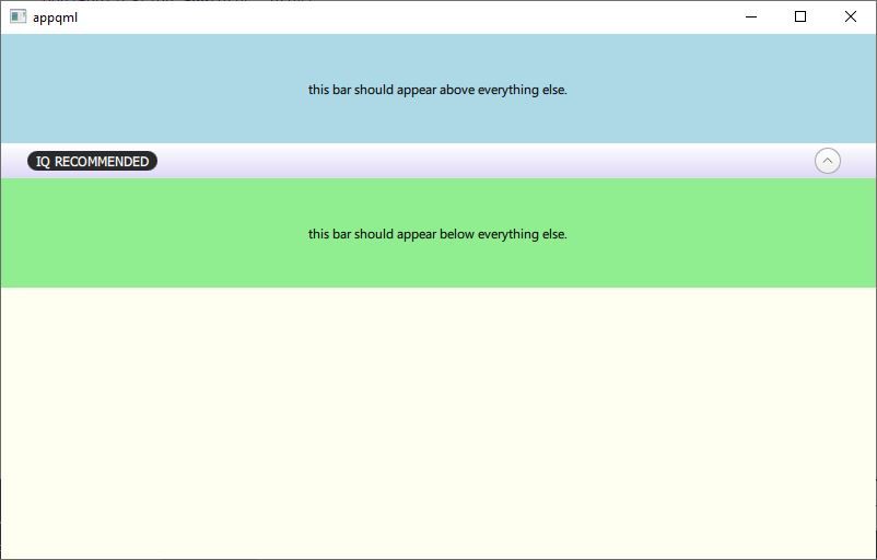
// Main.qml import QtQuick import QtQuick.Controls import QtQuick.Layouts ApplicationWindow { id: mainWindow visible: true width: 800 height: 480 ColumnLayout { anchors.fill: parent spacing: 0 CollapsibleBar { id: collapsibleBar Layout.alignment: Qt.AlignVCenter | Qt.AlignTop contents: Rectangle { implicitHeight: 300 // this is causing the problem. width: mainWindow.width color: 'lightgray' Text { anchors.centerIn: parent text: 'this light gray bar should appear below the light blue bar.' } } } Rectangle { y: collapsibleBar.height Layout.preferredHeight: 100 Layout.fillWidth: true color: 'lightgreen' Text { anchors.centerIn: parent text: "this light green bar should appear below everything else." } } } } // CollapsibleBar.qml import QtQuick import QtQuick.Controls import QtQuick.Layouts Rectangle { id: bar color: "lightblue" default property alias contents: contentItem.children property bool collapsed: true height: contentsArea.height width: mainWindow.width Column { id: contentsArea RowLayout { id: barHeader width: mainWindow.width height: 32 RoundButton { implicitWidth: 24 implicitHeight: 24 onClicked: { bar.collapsed = !bar.collapsed; } } Text { // Layout.Alignment: Qt.AlignHCenter // BTW: this line doesn't compile. text: "this light blue bar should appear above everything." } } Column { id: contentItem clip: true height: bar.collapsed ? 0 : implicitHeight Behavior on height { NumberAnimation { duration: 500 } } } } } -
@fcarney this is very close to working as desired. I've added a couple things to Main.qml to represent the desired usage. It almost works perfectly; the only problem is the initial height of the collapsing area -- it's taking the value from the contents setting in Main.qml.
Any ideas on what could be done about this?
Here's the complete code. Thanks...
// Main.qml import QtQuick import QtQuick.Controls import QtQuick.Layouts ApplicationWindow { id: mainWindow visible: true width: 800 height: 480 ColumnLayout { anchors.fill: parent spacing: 0 CollapsibleBar { id: collapsibleBar Layout.alignment: Qt.AlignVCenter | Qt.AlignTop contents: Rectangle { implicitHeight: 300 // this is causing the problem. width: mainWindow.width color: 'lightgray' Text { anchors.centerIn: parent text: 'this light gray bar should appear below the light blue bar.' } } } Rectangle { y: collapsibleBar.height Layout.preferredHeight: 100 Layout.fillWidth: true color: 'lightgreen' Text { anchors.centerIn: parent text: "this light green bar should appear below everything else." } } } } // CollapsibleBar.qml import QtQuick import QtQuick.Controls import QtQuick.Layouts Rectangle { id: bar color: "lightblue" default property alias contents: contentItem.children property bool collapsed: true height: contentsArea.height width: mainWindow.width Column { id: contentsArea RowLayout { id: barHeader width: mainWindow.width height: 32 RoundButton { implicitWidth: 24 implicitHeight: 24 onClicked: { bar.collapsed = !bar.collapsed; } } Text { // Layout.Alignment: Qt.AlignHCenter // BTW: this line doesn't compile. text: "this light blue bar should appear above everything." } } Column { id: contentItem clip: true height: bar.collapsed ? 0 : implicitHeight Behavior on height { NumberAnimation { duration: 500 } } } } } -
I love it when I come back to something after a couple weeks, and the problem goes away.
I still had some layout issues to deal with, and this solution isn't perfect; the caller has to manually reposition anything below the collapsible bar using y coordinates, but it does work nicely, and it's fairly easy to understand.
For anyone who wants it, here's the complete code (with a few extras thrown in for the example);
main.qml
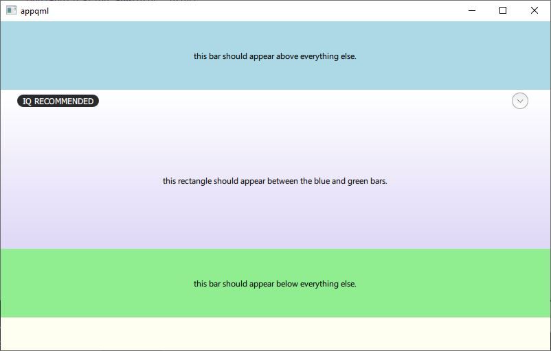
import QtQuick
import QtQuick.Controls
import QtQuick.Layouts

ApplicationWindow {
    id: mainWindow

    visible: true
    width: 800
    height: 480
    color: 'ivory'

    ColumnLayout {
        anchors.fill: parent
        spacing: 0

        Rectangle {
            Layout.preferredHeight: 100
            Layout.fillWidth: true
            color: 'lightblue'
            Text {
                anchors.centerIn: parent
                text: "this bar should appear above everything else."
            }
        }

        CollapsibleBar {
            id: collapsibleBar
            Layout.alignment: Qt.AlignVCenter | Qt.AlignTop
            contents: Rectangle {
                implicitHeight: 200 // this is causing the problem.
                width: mainWindow.width
                color: 'transparent'
                Text {
                    anchors.centerIn: parent
                    text: 'this rectangle should appear between the blue and green bars.'
                }
            }
        }

        Rectangle {
            y: collapsibleBar.height + collapsibleBar.y // THIS IS IMPORTANT
            Layout.preferredHeight: 100
            Layout.fillWidth: true
            color: 'lightgreen'
            Text {
                anchors.centerIn: parent
                text: "this bar should appear below everything else."
            }
        }
        Item {
            Layout.fillHeight: true
            Layout.fillWidth: true
        }
    }
}
CollapsibleBar.qml
import QtQuick
import QtQuick.Controls
import QtQuick.Layouts

Rectangle {
    id: bar

    default property alias contents: contentItem.children
    property bool collapsed: true

    height: contentsArea.height
    width: mainWindow.width

    gradient: Gradient {
        GradientStop { position: 0.0; color: 'white' }
        GradientStop { position: 1.0; color: '#ded7f6' }
    }

    Column {
        id: contentsArea

        RowLayout {
            id: barHeader

            width: mainWindow.width
            height: 32

            Label {
                Layout.alignment: Qt.AlignLeft | Qt.AlignVCenter
                Layout.leftMargin: 32
                text: "IQ RECOMMENDED"
                color: 'white'
                font.family: "Barlow"
                font.pixelSize: 12
                font.weight: Font.DemiBold
                background: Rectangle {
                    anchors.centerIn: parent
                    width: parent.width + (8 * 2)
                    height: parent.height + (2 * 2)
                    radius: height / 2
                    color: '#29292A'
                }
            }

            RoundButton {
                id: expanderButton
                Layout.alignment: Qt.AlignRight | Qt.AlignVCenter
                Layout.rightMargin: 32
                Layout.maximumHeight: 24 // note: must use maximumHeight/Weight when within Layout.
                Layout.maximumWidth: 24
                icon {
                    source: "qrc:/Collapse.svg"
                }

                Behavior on rotation {
                    NumberAnimation {
                        duration: 500
                        easing.type: Easing.InOutQuad
                    }
                }
                onClicked: {
                    bar.collapsed = !bar.collapsed;
                    expanderButton.rotation = (expanderButton.rotation + 180) % 360
                }
            }
        }

        Column {
            id: contentItem
            clip: true
            height: bar.collapsed ? 0 : implicitHeight

            Behavior on height {
                NumberAnimation {
                    duration: 500
                }
            }
        }
    }
}
As always, comments and questions are welcome.
-
 M mzimmers has marked this topic as solved on
-
I love it when I come back to something after a couple weeks, and the problem goes away.
I still had some layout issues to deal with, and this solution isn't perfect; the caller has to manually reposition anything below the collapsible bar using y coordinates, but it does work nicely, and it's fairly easy to understand.
For anyone who wants it, here's the complete code (with a few extras thrown in for the example);
main.qml
import QtQuick
import QtQuick.Controls
import QtQuick.Layouts

ApplicationWindow {
    id: mainWindow

    visible: true
    width: 800
    height: 480
    color: 'ivory'

    ColumnLayout {
        anchors.fill: parent
        spacing: 0

        Rectangle {
            Layout.preferredHeight: 100
            Layout.fillWidth: true
            color: 'lightblue'
            Text {
                anchors.centerIn: parent
                text: "this bar should appear above everything else."
            }
        }

        CollapsibleBar {
            id: collapsibleBar
            Layout.alignment: Qt.AlignVCenter | Qt.AlignTop
            contents: Rectangle {
                implicitHeight: 200 // this is causing the problem.
                width: mainWindow.width
                color: 'transparent'
                Text {
                    anchors.centerIn: parent
                    text: 'this rectangle should appear between the blue and green bars.'
                }
            }
        }

        Rectangle {
            y: collapsibleBar.height + collapsibleBar.y // THIS IS IMPORTANT
            Layout.preferredHeight: 100
            Layout.fillWidth: true
            color: 'lightgreen'
            Text {
                anchors.centerIn: parent
                text: "this bar should appear below everything else."
            }
        }
        Item {
            Layout.fillHeight: true
            Layout.fillWidth: true
        }
    }
}
CollapsibleBar.qml
import QtQuick
import QtQuick.Controls
import QtQuick.Layouts

Rectangle {
    id: bar

    default property alias contents: contentItem.children
    property bool collapsed: true

    height: contentsArea.height
    width: mainWindow.width

    gradient: Gradient {
        GradientStop { position: 0.0; color: 'white' }
        GradientStop { position: 1.0; color: '#ded7f6' }
    }

    Column {
        id: contentsArea

        RowLayout {
            id: barHeader

            width: mainWindow.width
            height: 32

            Label {
                Layout.alignment: Qt.AlignLeft | Qt.AlignVCenter
                Layout.leftMargin: 32
                text: "IQ RECOMMENDED"
                color: 'white'
                font.family: "Barlow"
                font.pixelSize: 12
                font.weight: Font.DemiBold
                background: Rectangle {
                    anchors.centerIn: parent
                    width: parent.width + (8 * 2)
                    height: parent.height + (2 * 2)
                    radius: height / 2
                    color: '#29292A'
                }
            }

            RoundButton {
                id: expanderButton
                Layout.alignment: Qt.AlignRight | Qt.AlignVCenter
                Layout.rightMargin: 32
                Layout.maximumHeight: 24 // note: must use maximumHeight/Weight when within Layout.
                Layout.maximumWidth: 24
                icon {
                    source: "qrc:/Collapse.svg"
                }

                Behavior on rotation {
                    NumberAnimation {
                        duration: 500
                        easing.type: Easing.InOutQuad
                    }
                }
                onClicked: {
                    bar.collapsed = !bar.collapsed;
                    expanderButton.rotation = (expanderButton.rotation + 180) % 360
                }
            }
        }

        Column {
            id: contentItem
            clip: true
            height: bar.collapsed ? 0 : implicitHeight

            Behavior on height {
                NumberAnimation {
                    duration: 500
                }
            }
        }
    }
}
As always, comments and questions are welcome.
hey mr.zimmers, I often read your questions but can rarely help out, but I still like to run your code sometimes to see what I get.
In this case, I get a white screen with a lightblue bar containing text at the top and nothing else. I assume there should be text in the centre of the lightblue bar and a lightgreen bar, but the lightgreen bar does not show at all. How does your app look and function when running?
The only thing I cannot use is RoundButton and 'background' for Label/Text, these are missing in SailfishSDK for some reason, licensing I guess.
I'm building this on Sailfish SDK with/for my Sony Xperia 10II device.
Don't just sit there standing around, pick up a shovel and sweep up!
I live by the sea, not in it.
-
hey mr.zimmers, I often read your questions but can rarely help out, but I still like to run your code sometimes to see what I get.
In this case, I get a white screen with a lightblue bar containing text at the top and nothing else. I assume there should be text in the centre of the lightblue bar and a lightgreen bar, but the lightgreen bar does not show at all. How does your app look and function when running?
The only thing I cannot use is RoundButton and 'background' for Label/Text, these are missing in SailfishSDK for some reason, licensing I guess.
I'm building this on Sailfish SDK with/for my Sony Xperia 10II device.
Qt 6.5.1, running on Windows 10, Fusion style.I know nothing about Sailfish, so I can't speak to that. I would recommend, though, that you experiment with changing styles, to see if that does anything for you.