formatting a ChartView
-
Hi all -
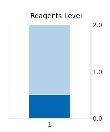
Customer wants something that looks like this:

The very small dark blue rectangle is supposed to be the bar itself; the light blue is the background (accent).So, I was thinking of using a ChartView for this.
    ChartView {
        height: 300
        width: 100
        anchors.top: spacer2.bottom
        anchors.horizontalCenter: parent.horizontalCenter
        legend.visible: false
        antialiasing: true

        StackedBarSeries {
            id: mySeries
            axisYRight: BarCategoryAxis {
                visible: true
                labelsVisible: true
            }
            barWidth: 0.96
            BarSet {
                values: [0.1]
                color: reagentPlotColor
            }
            BarSet {
                values: [1.9]
                color: reagentPlotBackgroundColor
            }
        }
    }
I'm having trouble getting it properly formatted, though:
So:
- does a ChartView seem like a good way to do this, or is it overkill?
- how do I get the scale to appear on the right (or at all)?
- any idea why the chart isn't honoring my request for a width of 100 px?
Thanks...
-
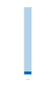
So, after some experimentation, I've managed to get it to look like this:

Here's the code:ChartView { width: parent.width height: 300 anchors.horizontalCenter: parent.horizontalCenter antialiasing: true title: 'Reagents Level' StackedBarSeries { id: mySeries labelsVisible: false axisY: BarCategoryAxis { gridVisible: false } barWidth: 0.33 BarSet { values: [0.1] color: reagentPlotColor } BarSet { values: [1.9] color: reagentPlotBackgroundColor } } }So, some specific questions:
- is there such a thing as an individual Bar, or is it correct to use BarSet when you only have one?
How do I get rid of:
- the color legend above the bar
- the number "1" below the bar
- the vertical line on the left
- can I get a scale indicator on the right side, and if so, can I have control over the granularity?
Thanks...
- is there such a thing as an individual Bar, or is it correct to use BarSet when you only have one?
-
@fcarney oh, that's very helpful:
      ValueAxis {
        id: valueAxisX
        labelsVisible: false
        gridVisible: false
      }
This gets rid of both that "1" AND the left side line. No need for the rectangle hacks!
So...where was that "1" coming from, anyway? It wasn't a label; I say this because when I remove the "labelsVisible: false" I get this:
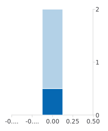
What would be ideal is if I could change that 1 to my own text. Customer wants the title below the chart, not above it, which doesn't seem to be an option in ChartView, but if I could repurpose that "1" I could kill two birds with one stone.
Thanks...
-
https://doc.qt.io/qt-5/qml-qtcharts-abstractaxis.html#alignment-prop
I don't know what the key/legend is called in the chart. Look around and see if it has a way to move it. The above link shows how to align an axis. Not sure if that helps or not.
C++ is a perfectly valid school of magic.
-
https://doc.qt.io/qt-5/qml-qtcharts-abstractaxis.html#alignment-prop
I don't know what the key/legend is called in the chart. Look around and see if it has a way to move it. The above link shows how to align an axis. Not sure if that helps or not.
@fcarney yeah, I think I can't use the legend, because that includes the little colored box which I don't want.
It's still a mystery to me where that 1 is/was coming from, but I think I'll just superimpose a label (hacky, hacky).
Thanks for the assistance.
-
@fcarney yeah, I think I can't use the legend, because that includes the little colored box which I don't want.
It's still a mystery to me where that 1 is/was coming from, but I think I'll just superimpose a label (hacky, hacky).
Thanks for the assistance.