Solved Issue aligning text to the right inside of column
-
I am having issues aligning my text to the right, with multiple text items laid out vertically in a column. I would like to align the "values"columns ( 75, 75, 8.9) to the right, and the units columns(gal, gal, gal/hr) to the left. Each of the pairs of columns would ideally be aligned centered underneath each gauge. I have used "horizontalAlignment: Text.AlignRight" and AlignLeft and notice no change to the text alignment. help please?
I am using Qt version 5.1.1
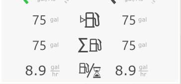
for a reference image of what i am attemptingimport QtQuick 2.1
import QtQuick.Controls 1.0import "Style.js" as Style
Rectangle { id: tileContent height: 183 width: 256 color: "#e9e9e9" Row { id: rowgauges spacing: 46 x: 27 y: 5 Image { id: phgauge1 fillMode: Image.PreserveAspectFit source: "/images/fuelconsumptiongauge.png" } Item { id: spacerItem6 width: 45 } Image { id: phgauge2 fillMode: Image.PreserveAspectFit source: "/images/defconsumptiongauge.png" } } Column { id: column1 spacing: 10 anchors.topMargin: 5 anchors.top: rowgauges.bottom anchors.right: column2.left Text { id: text11 text: qsTr("75") Component.onCompleted: {Style.styleTileConsVals(text11);} } Text { id: text21 text: qsTr("75") Component.onCompleted: {Style.styleTileConsVals(text21);} } Text { id: text31 text: qsTr("8.9") Component.onCompleted: {Style.styleTileConsVals(text31);} } } Column { id: column2 spacing: 22 anchors.top: rowgauges.bottom anchors.topMargin: 12 anchors.horizontalCenter: rowgauges.left anchors.horizontalCenterOffset: 45 Text { id: text12 text: qsTr("gal") Component.onCompleted: {Style.styleTileConsUnits(text12);} } Text { id: text22 text: qsTr("gal") Component.onCompleted: {Style.styleTileConsUnits(text22);} } Text { id: text32 text: qsTr("gal") Component.onCompleted: {Style.styleTileConsUnits(text32);} } } Column { id:column3 anchors.horizontalCenter: tileContent.horizontalCenter y: 80 spacing: 15 Image { id: icon1 fillMode: Image.PreserveAspectFit source: "/images/icon_fuelLvlValue.png" } Image { id: icon2 fillMode: Image.PreserveAspectFit source: "/images/icon_FuelCons.png" } Image { id: icon3 fillMode: Image.PreserveAspectFit source: "/images/icon_ConsPerHr.png" } } Column { id: column4 spacing: 10 anchors.top: rowgauges.bottom anchors.topMargin: 5 anchors.right: column5.left Text { id: text13 text: qsTr("75") horizontalAlignment: Text.AlignRight Component.onCompleted: {Style.styleTileConsVals(text13);} } Text { id: text23 text: qsTr("75") horizontalAlignment: Text.AlignRight Component.onCompleted: {Style.styleTileConsVals(text23);} } Text { id: text33 text: qsTr("8.9") horizontalAlignment: Text.AlignRight Component.onCompleted: {Style.styleTileConsVals(text33);} } } Column { id: column5 spacing: 22 anchors.top: rowgauges.bottom anchors.topMargin: 12 anchors.horizontalCenter: rowgauges.right anchors.horizontalCenterOffset: -30 Text { id: text14 text: qsTr("gal") horizontalAlignment: Text.AlignLeft Component.onCompleted: {Style.styleTileConsUnits(text14);} } Text { id: text24 text: qsTr("gal") horizontalAlignment: Text.AlignLeft Component.onCompleted: {Style.styleTileConsUnits(text24);} } Text { id: text34 text: qsTr("gal") horizontalAlignment: Text.AlignLeft Component.onCompleted: {Style.styleTileConsUnits(text34);} } } } -
Hi @klopp , here is the sample code:-
Rectangle { id: tileContent height: 200 width: 200 color: "#e9e9e9" Row { id: headerRow height: 50 width: parent.width Rectangle { height: parent.height width: parent.width / 3 color: "red" Text { text: "Header 1" anchors.centerIn: parent } } Rectangle { height: parent.height width: parent.width / 3 color: "green" Text { text: "Header 2" anchors.centerIn: parent } } Rectangle { height: parent.height width: parent.width / 3 color: "blue" Text { text: "Header 3" anchors.centerIn: parent } } } Row { width: parent.width height: parent.height - headerRow.height anchors.top: headerRow.bottom Row { width: parent.width / 3 height: parent.height Column { height: parent.height width: parent.width / 2 Text { text: "75" width: parent.width height: parent.height / 3 horizontalAlignment : Text.AlignRight verticalAlignment: Text.AlignVCenter } Text { text: "75" width: parent.width height: parent.height / 3 horizontalAlignment : Text.AlignRight verticalAlignment: Text.AlignVCenter } Text { text: "8.9" width: parent.width height: parent.height / 3 horizontalAlignment : Text.AlignRight verticalAlignment: Text.AlignVCenter } } Column { height: parent.height width: parent.width / 2 Text { text: "gal" color: "grey" width: parent.width height: parent.height / 3 horizontalAlignment : Text.AlignLeft verticalAlignment: Text.AlignVCenter padding: 5 } Text { text: "gal" color: "grey" width: parent.width height: parent.height / 3 horizontalAlignment : Text.AlignLeft verticalAlignment: Text.AlignVCenter padding: 5 } Text { text: "gal" color: "grey" width: parent.width height: parent.height / 3 horizontalAlignment : Text.AlignLeft verticalAlignment: Text.AlignVCenter padding: 5 } } } Column { width: parent.width / 3 height: parent.height Rectangle { width: parent.width height: parent.height / 3 color: "transparent" border.color: "orange" Text { text: "Image 1" anchors.centerIn: parent } } Rectangle { width: parent.width height: parent.height / 3 color: "transparent" border.color: "orange" Text { text: "Image 2" anchors.centerIn: parent } } Rectangle { width: parent.width height: parent.height / 3 color: "transparent" border.color: "orange" Text { text: "Image 3" anchors.centerIn: parent } } } Row { width: parent.width / 3 height: parent.height Column { height: parent.height width: parent.width / 2 Text { text: "75" width: parent.width height: parent.height / 3 horizontalAlignment : Text.AlignRight verticalAlignment: Text.AlignVCenter } Text { text: "75" width: parent.width height: parent.height / 3 horizontalAlignment : Text.AlignRight verticalAlignment: Text.AlignVCenter } Text { text: "8.9" width: parent.width height: parent.height / 3 horizontalAlignment : Text.AlignRight verticalAlignment: Text.AlignVCenter } } Column { height: parent.height width: parent.width / 2 Text { text: "gal" color: "grey" width: parent.width height: parent.height / 3 horizontalAlignment : Text.AlignLeft verticalAlignment: Text.AlignVCenter padding: 5 } Text { text: "gal" color: "grey" width: parent.width height: parent.height / 3 horizontalAlignment : Text.AlignLeft verticalAlignment: Text.AlignVCenter padding: 5 } Text { text: "gal" color: "grey" width: parent.width height: parent.height / 3 horizontalAlignment : Text.AlignLeft verticalAlignment: Text.AlignVCenter padding: 5 } } } } }
Note:- This is how the UI of my sample code will look like, you need to put your images and values.
I would suggest you to use Layouts, if you are developing a re-sizable UI or a Interface.
For more details you can have a look at the documentation[https://doc.qt.io/qt-5/qtquicklayouts-index.html] -
@klopp
Dear Juergen Klopp, I wish you & Liverpool all the best in the June Champions League Final. I didn't realise you were a Qt programmer in your spare time, please concentrate on the match! -
this really worked well. Thank you so much!