
Gradient color and glow on chart
-
Hi guys,
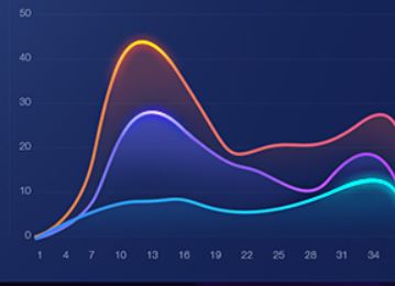
I wanna to have gradient color and glow on chart.
Like this picture:
I use this code but it does not work.Glow { anchors.fill: chartView radius: 18 samples: 37 color: "#15bdff" source: chartView } ChartView { id: chartView // visible: false // title: "Test" anchors.fill: parent // antialiasing: true backgroundColor: "transparent" legend.visible: false //theme: ChartView.ChartThemeBrownSand animationOptions: ChartView.AllAnimations // dropShadowEnabled: true ValueAxis { id: valueAxis min: 2000 max: 2011 // tickCount: 12 //labelFormat: "%.0f" } AreaSeries { name: "Test" axisX: valueAxis //color:"transparent" //ColorAnimation on color { to: "yellow"; duration: 1000 } //color: "green" //borderColor: "white" //borderWidth: 4 //brushFilename: "qrc:/backgroundChart.jpg" upperSeries: LineSeries { id:linechart capStyle: Qt.RoundCap LinearGradient { anchors.fill: parent start: Qt.point(0, 0) end: Qt.point(0, 300) gradient: Gradient { GradientStop { position: 0.0; color: "white" } GradientStop { position: 1.0; color: "black" } } } XYPoint { x: 2000; y: 1 } XYPoint { x: 2001; y: 1 } XYPoint { x: 2002; y: 1 } XYPoint { x: 2003; y: 1 } XYPoint { x: 2004; y: 1 } XYPoint { x: 2005; y: 0 } XYPoint { x: 2006; y: 1 } XYPoint { x: 2007; y: 1 } XYPoint { x: 2008; y: 4 } XYPoint { x: 2009; y: 3 } XYPoint { x: 2010; y: 2 } XYPoint { x: 2011; y: 1 } } } }Please guide me.
thanks -
@neda
As a rough approximation, the following is my idiotic approach to your problem:
The code is below. Unfortunately, the overlaid grid does not exactly match the glowing plots, because in order to achieve the effect, the grid lines and axes (and labels) must be made invisible (lest they would be shown glowing as well). This will make the effective plot area larger for these...
For what it is worth:
    LinearGradient {
        anchors.fill: parent
        start: Qt.point(0, 0)
        end: Qt.point(0, 300)
        gradient: Gradient {
            GradientStop { position: 0.0; color: "white" }
            GradientStop { position: 8.0; color: "black" }
            GradientStop { position: 1.0; color: "grey" }
        }
    }

    ChartView {
        id: chartView
        anchors.fill: parent
        backgroundColor: "transparent"
        legend.visible: false

        Component.onCompleted: {
            axisX(lineSeries).visible = false
            axisY(lineSeries).visible = false
        }

        ValueAxis {
            id: valueAxisX
            min: 0
            max: 50
            color: "transparent"
            labelsFont:Qt.font({pointSize: 12})
        }

        ValueAxis {
            id: valueAxisY
            min: 10
            max: 200
            color: "transparent"
        }

        SplineSeries {
            id: lineSeries
            name: "LineSeries"
            color: "blue"
            width: 8
            XYPoint { x: 0; y: 0 }
            XYPoint { x: 1.1; y: 2.1 }
            XYPoint { x: 1.9; y: 3.3 }
            XYPoint { x: 2.1; y: 2.1 }
            XYPoint { x: 2.9; y: 4.9 }
            XYPoint { x: 3.4; y: 3.0 }
            XYPoint { x: 4.1; y: 3.3 }
        }
    }

    Glow {
        id: glow1
        anchors.fill: chartView
        radius: 20
        samples: 20
        spread: 0.35
        color: "blue"
        visible: true
        source: chartView
    }

      ChartView {
        id: chartView2
        anchors.fill: parent
        backgroundColor: "transparent"
        legend.visible: false

        Component.onCompleted: {
            axisX(lineSeries2).visible = false
            axisY(lineSeries2).visible = false
        }

        ValueAxis {
            id: valueAxisX2
            min: 0
            max: 50
            color: "transparent"
        }

        ValueAxis {
            id: valueAxisY2
            min: 10
            max: 200
            color: "transparent"
        }

        SplineSeries {

            id: lineSeries2
            name: "LineSeries"
            color: "red"
            width: 8
            XYPoint { x: 0; y: 0 }
            XYPoint { x: 1.1; y: 3.1 }
            XYPoint { x: 1.9; y: 2.3 }
            XYPoint { x: 2.1; y: 1.1 }
            XYPoint { x: 2.9; y: 3.9 }
            XYPoint { x: 3.4; y: 3.0 }
            XYPoint { x: 4.1; y: 2.3 }
        }
    }

    Glow {
        id: glow2
        anchors.fill: chartView2
        radius: 20
        samples: 20
        spread: 0.35
        color: "red"
        visible: true
        source: chartView2
    }

    ChartView {
        anchors.fill: parent

        id: chartView3
        backgroundColor: "transparent"
        legend.visible: false

        Component.onCompleted: {
            axisX(lineSeries3).gridVisible = false
            axisY(lineSeries3).gridVisible = false
        }

        ValueAxis {
            id: valueAxisX3
            min: 0
            max: 50
            color: "transparent"
        }

        ValueAxis {
            id: valueAxisY3
            min: 10
            max: 200
            color: "transparent"
        }

        SplineSeries {
            id: lineSeries3
            name: "LineSeries"
            color: "transparent"
            width: 8
            XYPoint { x: 0; y: 0 }
            XYPoint { x: 1.1; y: 3.1 }
            XYPoint { x: 1.9; y: 2.3 }
            XYPoint { x: 2.1; y: 1.1 }
            XYPoint { x: 2.9; y: 3.9 }
            XYPoint { x: 3.4; y: 3.0 }
            XYPoint { x: 4.1; y: 2.3 }
        }
    }
For more control and possibilities, you should probably do it in C++. Hopefully some specialist in graphical effects wil l be able to help you.
-
Thank you very much.
How can I gradient the chart?
Like this:

-
@neda
I don't know if that's possible in QML, given that QML has a more limited API than the C++ classes. In particular, there seems to be no way to change the brush used to draw the series.In this C++ example:
https://doc.qt.io/qt-5/qtcharts-customchart-example.html
you can change the brush of the pen you use for the plotted lines.
To get the above picture, I just defined the following gradient:
    QRadialGradient gr(300, 100, 100, 60, 60);
    gr.setColorAt(0.0, QColor(255, 0, 0, 191));
    gr.setColorAt(0.2, QColor(255, 0, 127, 191));
    gr.setColorAt(0.9, QColor(150, 0, 200, 63));
and modified the pen to use it:
    // Customize series
    QPen pen(QRgb("#ff0000"));
    pen.setWidth(20);
    pen.setBrush(gr);
    series->setPen(pen);
(you may need to drag-resize the window to get the gradient center right).
However, as I wrote, I don't know much about graphics effects. There are probably methods to apply gradient masks, etc... Where are the specialists out there?
-
Thank you so much for your help I really appreciate it.
-
@Diracsbracket For the same logic,how to implement the same in QML..please i need your help